
|
#2
 12-19-2006, 01:48 AM
|
||||
|
||||
|
I think a banner competition would be a great idea. Maybe brad would be kind enough to lay down some guidelines (to make sure its kinda in line with something he'd like) and rules and brad would also retain veto powers. I think we certanly have the talent in our members to come up with something good. Also,I don't see why we couldn't have several "official" banners at the same time.
__________________
C'est ta faute... mais on t'aime quand même, Alizée!
Tu m'as pris dès le premier "moi." 
|
|
#4
12-19-2006, 02:28 AM
|
||||
|
||||
|
well i must wait for your ideas guys!!! our web is the most visited on latin america, and some guys in europe know about it so keep the hard work on!!!
__________________
http://www.alizee-latino.com Official Fanclub in México
|
|
#5
12-19-2006, 04:32 PM
|
||||
|
||||
|
i can't think of any real 'guidelines' .. i don't want to disrupt the creative process. i will say that i tend to like simple, clean types of designs.
it would be neat to have the American flag somehow as the background, but I know we have a lot of non-american members too .. so i am not sure if that is a good idea. Also, i'm not sure how good it could look being so small. Last edited by brad; 12-19-2006 at 04:35 PM..
|
|
#6
12-19-2006, 06:36 PM
|
||||
|
||||
|
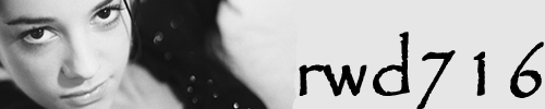
It's not finished yet, but here's what I made as a concept
 The idea is to use the red, white and blue as colours to represent america, but those colours could also represent the blue, white and red (france's flag).
|
|
#7
12-19-2006, 06:51 PM
|
||||
|
||||
|
Quote:
I think Hiby is really on the right track: our name, our adress, and an image that reflects the home page (our "front door," so to speak). Using red, white, and blue as colors I think is a great idea also because they are common colors in both the American and French flags. In fact I think Hiby's design would be perfectly acceptable as is (though I don't want to comment too strongly before others have had a crack at it). I'm just partial to a bit artistic brushwork (a la Amelie), but that's just personal preference.
__________________
C'est ta faute... mais on t'aime quand même, Alizée!
Tu m'as pris dès le premier "moi." Last edited by CFHollister; 12-19-2006 at 06:57 PM..
|
|
#9
12-19-2006, 07:04 PM
|
||||
|
||||
|
I only wish the space was larger, there isn't much you can fit in 350x60..
I would do some brushing, but Brad was saying that he likes simple designs, brushing usually complicates the whole thing beyond the tastes of most people. Simple is the best way to go here, since we are trying to appeal to the broadest audience possible. BTW: the image in the banner isn't quite optimized to be shrunk, so there is a lot of aliasing in it right now. I'll take that out when I have some time  I want to see what bt_bird and amelie come up with! (assuming they want to make one, that is)
|
|
#10
12-19-2006, 07:31 PM
|
||||
|
||||
|
Quote:
basically just like it is now, but the text is more to the left and there is less red than there is blue. I like using hot and cool colors together like that, and keeping "Alizee" in the red coloring (and making less red than blue) makes it look more important. i like it, it is simple and very nice is it even necessary to put the url for the website on it? it would look better without it i think .. but maybe it should be on there? One last thing, the image of alizee looks a little blurry, if you use the scale tool in photoshop instead the resize, it will make a better smaller version of the image. Last edited by brad; 12-19-2006 at 07:33 PM..
|
 |
|
|


 Linear Mode

